AECData Python Library Step 3— Visualizations & Statistical Analysis
 We go step by step and explain how to start with the filtering and retrieval of data on aecdata (see code below).
Done with data retrieval, on with the stats!
Welcome to the third tutorial on using the open-source AECdata library provided by 2050 Materials.
In this tutorial, we’ll learn how to plot visualizations and derive statistics from your data. This guide will cover grouping data by category and location, removing outliers, and calculating median values and quartiles. Plus, we’ll show how to create a distribution plot.
Setting Up Your Environment
Before diving into the statistics and plots, ensure you’ve imported the necessary classes from the aecdata library:
from aecdata import ProductData, ProductStatistics
import pandas as pd
Initializing the ProductStatistics Class
Start by creating an instance of the ProductStatistics class. This class extends the functionalities of the ProductData class, allowing for advanced data analysis.
Grouping and Filtering Data
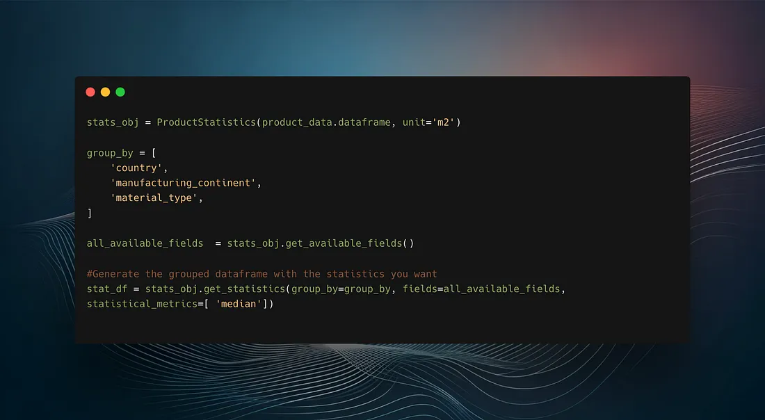
One of the powerful features of the ProductStatistics class is its ability to group and filter data efficiently. Here’s how you can do it:
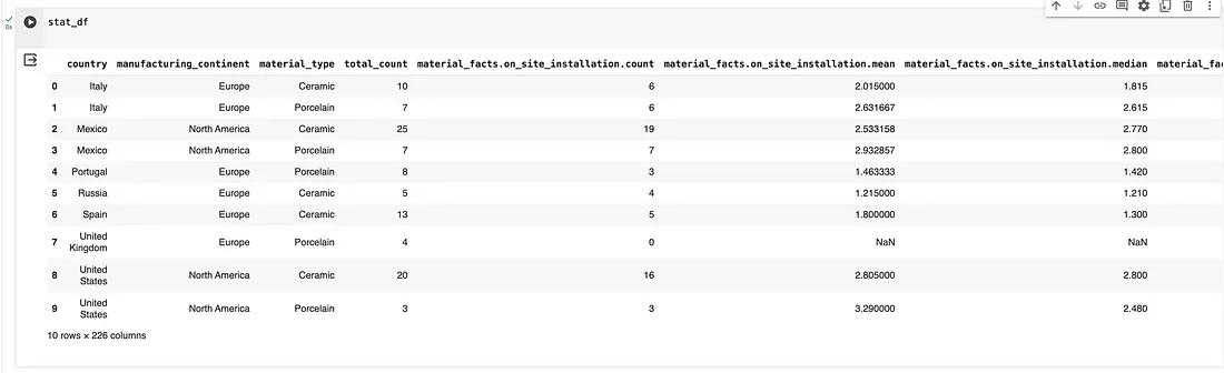
This code groups the data by country and material type, which is particularly useful for regional analysis and comparisons between different materials.
Outliers can skew the results of your data analysis. The ProductStatistics class includes methods to remove these effectively. Notice above in the get_statistics() function the parameter remove_outliers=True
Plotting Data Distributions
Visualizations can help understand the distribution of data. Let’s plot a histogram and a boxplot:

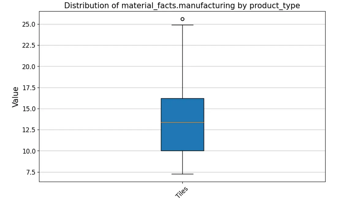
These plots will provide visual insights into the distribution and variance of the impact factors across different material types.
Done, for now!
You’re now set up with aecdata and have used theProductStatistics class, to perform detailed statistical analysis and visualizations.
This tutorial covered grouping data, removing outliers, and visualizing distributions, which are crucial for making informed decisions based on your data.
Stay tuned for our next tutorial, where we’ll go over how to implement aecdata within a data-science environment!
Stay tuned, and happy coding!
This library is provided by 2050 Materials, a company dedicated to unlocking the value of data in the construction industry to enable the climate transition.
If you are interested in embedding this data within your workflows, or have a specific problem, reach out to us at api@2050-materials.com
Related articles
Reading Between the EPD Lines
Two EPDs can report almost the same A1 to A3 carbon figure and still deserve very different levels of trust. Here is how to read the fine print.
Read more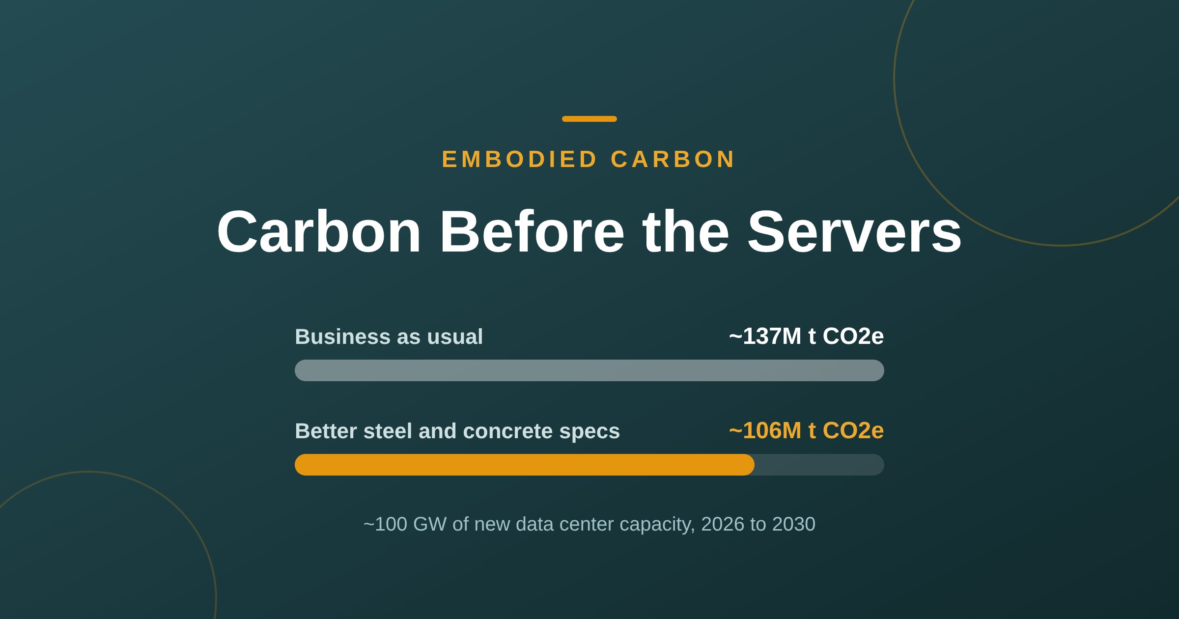
Data Centers’ Hidden 137M-Tonne Carbon Bill
New data centers could lock in ~137M tonnes of CO2e before a single server switches on. GGBS concrete and recycled steel could cut about 31M of it.
Read more
Built to Beat the Heat
This summer's drought wasn't a fluke, it was a preview. Here's the material data that actually decides whether a building shrugs off a heatwave or quietly cooks behind a great winter U value: decrement delay, solar reflectance, SHGC, and the real products behind each one.
Read more